The Psychology of Color in Kuwaiti Luxury Brand Cinematography
Farizi
January 23, 2026
The Visual Language of Luxury
Color is more than just aesthetics; it's a powerful psychological tool. In the luxury markets of Kuwait—from high-end automotive to fine jewelry—the color palette of your cinematography defines your brand's identity and influences how the dinar is spent.
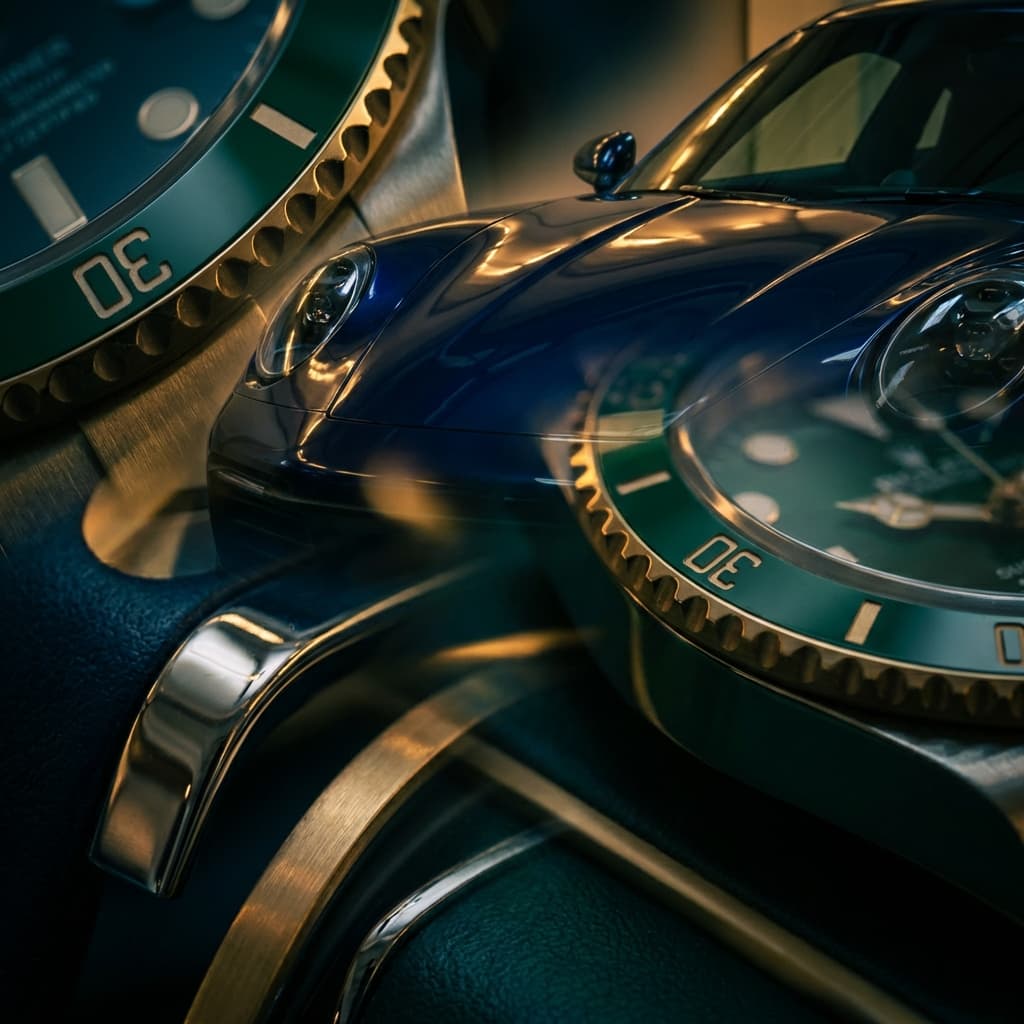
The Power of Deep Tones
Many luxury brands in Kuwait favor deep, rich tones: midnight blues, emerald greens, and sophisticated blacks. These colors evoke a sense of heritage, stability, and exclusivity. When paired with high-contrast cinematography, they create a visual "weight" that signifies premium quality.
"Color is the silent salesman of the luxury world."
Adapting to the Local Environment
Kuwait's natural light is intense and warm. Effective color grading involves balancing this natural warmth with cooler, sophisticated shadows to create a balanced, professional look. Understanding how to manipulate the "Golden Hour" light in Kuwait is essential for any high-end production.
Developing Your Brand's Signature Palette
- Identify Your Core Emotion: Do you want to feel modern and tech-forward (blues/whites) or traditional and luxurious (golds/darks)?
- Consistency is Key: Use the same color profile across all your video assets to build brand recognition in Kuwait.
- Test Against the Competition: Analyze the palettes used by your competitors and find a space that is uniquely yours.


